

- Nov 14, 2020
- 5 min read
“Ser Honesto con las Emociones”: An Interview with Agustín Gagliano
K. Iver

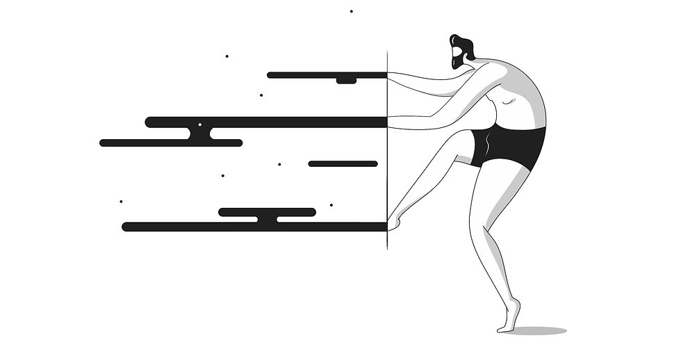
AGUSTÍN GAGLIANO is an architect and illustrator. He graduated from the National University of Córdoba. Born in Villa María, Córdoba, Argentina in 1992. His work focuses on the emotional, conjugated with the formal equilibrium and graphic synthesis, immersed in a silent, introspective frame and bound with a spirit playful and naive, but with conceptual strength. Though his sketches are made in a traditional paper and pencil, he found in digital tools and vector lines the way to express this synthesis with a polished style. In recent years his illustrations have been published in institutional books and magazines from the local university setting, independent digital magazines, and awarded by entities like the United Nations, the Inter-American Development Bank, and Allianz Global Investors, Spain.
K. Iver: I read that you began drawing as a child. What were your first subjects?
Agustín Gagliano: Así es, empecé desde chico, recuerdo que me despertaba mucha fascinación copiar los dibujos animados de la televisión, monstruos y ese tipo de cosas que escapaban a una realidad concreta mundos bastantes surrealistas.
Yes, it is. I started as a child, and I remember I found a fascination copying the TV cartoon, monsters, and these kind of things--escapes from concrete reality to surrealistic and fantastical ones.

KI: The style of your work is uniquely yours. I see a balance of cleanness and minimalism with boldness and vibrancy—a kind of risktaking you don’t see often. Can you talk about that?
AG: Bueno, la verdad es que es un concepto al que apuesto mucho, creo que estamos bombardeados de, formas y estímulos de todo tipo, sin embargo creo que podemos estar en la antesala de una era un más sobria, más medida y balanceada, sin tanto fuegos artificiales y ornamento, en mi mente hay una inquietud por querer depurar y quedarme con lo esencial, a hacer una ilustración amigable, y sin puntas.
Well, it is a concept that I think about a lot. I think we are bombarded by shapes and stimulations of many types, however, I think probably we are in the entrance of a new age, a measured, sober, and balanced age, without many ‘fireworks’ and ornaments. In my mind, there is a concern for wanting to debug and keep the essentials and make a friendly and organic illustration.
KI: You have a background in architecture, and so many of your images register as “built,” or as multi-dimensional shapes. How does your previous experience designing spaces meant for housing the human body play into your current illustrative work?
AG: La carrera de arquitectura sin dudas me ha enseñado a entender el proceso creativo, y creo que ese proceso lo trasladó a la ilustración, porque hay una instancia de conceptualización, una de estructuración, y otra de ejecución y sin dudas me dio un entendimiento de espacio del equilibrio.
The architecture career has undoubtedly taught me to understand the creative process, and I think that this process transferred it to illustration, because there is an instance of conceptualization, one of structuring, and another of execution, and that definitely gave me an understanding of balanced space.
KI: I’m drawn to the robust polish you bring to these illustrations. As you said, you’ve been drawing a long time. Can you also talk about the graphic dimension of your process?
AG: Por lo general mi proceso empieza en mi sketchbook con lápiz y papel, con trazos sensibles, sin líneas rigurosas, voy moldeando las figuras, exagerando las dimensiones de algunas partes del cuerpo, o posturas para enfatizar acciones o significados. Luego hay una fase de limpieza en donde estudio que líneas son necesarias, y cuales sobran. y luego hay un proceso de digitalización y de estudio del peso visual para lograr ese equilibrio. Encontré en las líneas vectoriales una herramienta que me permitió darle ese lenguaje minimalista y depurado, para enfatizar con más fuerza, el concepto, sin embargo hay ilustraciones que por su complejidad necesaria siento que comunican mejor en colores.
Usually, my process begins in my sketchbook with pencil and paper, with sensitive strokes, without rigorous lines, I shape the figures, exaggerating the dimensions of some parts of the body, or positions to emphasize actions or meanings. Then there is a cleaning phase where I study which lines are necessary, and which are leftover. And then there is a process of digitization and study of the visual weight to achieve that balance. I found in the vector lines a tool that allowed me to give it that minimalist and refined language, to emphasize the concept more strongly. However, there are illustrations that, due to their necessary complexity, I feel they communicate better in colors.
KI: You live in Córdoba (Argentina) after having grown up in a small town. How does the stimulation of a city provide inspiration, if at all?
AG: Me gusta la vida en la ciudad y sin dudas me aporta grandes estímulos, pero concretamente encuentro inspiración en muchísimos lados, puedo encontrarla en medio de la naturaleza, o en ciudades mas chicas, creo que mi trabajo va más relacionado a la introspección y ser honesto con las emociones.
I like the city lifestyle and it undoubtedly gives me great encouragement, but specifically, I find inspiration in many places. I can find it in the middle of nature, or in smaller cities. I think my work is more related to introspection and being honest with emotions.

KI: What artists/designers/illustrators do you keep returning to?
AG: A muchos, siempre vuelvo al trabajo de Daehyun Kim, también a Pablo Amargo, donde cada ilustración es una clase en sí misma, la forma en la que trabajan con los contrastes conjugados con la sensibilidad y emocionalidad conceptual es increíble, a fotógrafos como Chema Madoz que tiene un enfoque súper minimalista pero al mismo tiempo cuenta pequeñas historias y paradojas. Diseñadores como Jaime Hayon porque siento que logró diversificar la ilustración a otras disciplinas como los objetos, los muebles, el diseño interior, y crear un sello de identidad muy fuerte.
To many, some of them are Daehyun Kim, also to Pablo Amargo, where each illustration is a class in itself, the way in which they work with contrasts combined with sensitivity and conceptual emotionality is incredible, the photographer Chema Madoz who It has a super minimalist approach but at the same time it tells little stories and paradoxes. The designer Jaime Hayon because I feel that he managed to diversify illustration to other disciplines such as objects, furniture, interior design, and create a very strong identity seal.
KI: What are you working on now?
AG: Sigo con la creación de contenido constante, explorándome y ensayando nuevas temáticas, quiero lanzar pronto algunas ilustraciones inspiradas en el cine, también hay algunos proyectos de animación, en camino.
I still creating constant content, exploring myself, and trying new themes, I want to launch some illustrations inspired by films soon, there are also some animation projects underway.
KI: What’s next for you? What do you want for your work a decade from now?
AG: La verdad es que son momentos muy inciertos, estoy en una etapa de entender cómo va a ser el nuevo mundo luego de esta pandemia. Pero me gustaría seguir fortaleciendo mi identidad artística y dándola a conocer a través de diversos medios, me da curiosidad la idea de trabajar en conjunto con alguna marca y poder enfatizar esa comunicación, también me gustaría ensayar la idea de plasmar mi trabajo en distintos medios como interiores o incluso objetos.
To be honest, these are very uncertain moments, I am at a stage of understanding what the new world will be like after this pandemic. But I would like to continue strengthening my artistic identity and making it known through different media. I am curious about the idea of working together with a brand and being able to emphasize that communication. I would also like to try the idea to transfer my work in different formats such as interiors or even objects.
